Now Playing
ProA music card: cover art that leans toward the pointer, a scrubbable progress bar, transport controls and an accent picked from the artwork.
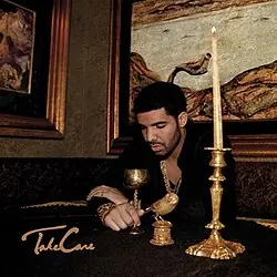
Take Care
Drake
pnpm dlx shadcn@latest add @latheui/now-playingPart of Lathe Pro. Set up your project once with your license key: npx latheui init --key <key>. See Lathe Pro.
Now Playing is part of Lathe Pro
The preview is live and free to try. The source, the install and every assembly come with Pro: $79 once, with lifetime updates.
Depends on
- lucide-react
- motion
- lathe/motion
- lathe/playback
- lathe/use-controllable-state
API reference
NowPlaying
Also accepts native section attributes.
| Prop | Type | Default | Description |
|---|---|---|---|
| tracks* (required) | { title: string; artist: string; cover: string; duration: number; src?: string }[] | — | The queue. With src the audio plays; without it, playback is simulated for designs and demos. |
| index | number | — | Controlled index of the current track. |
| defaultIndex | number | 0 | Track to start on. |
| onIndexChange | (index: number) => void | — | Called when the track changes. |
| playing | boolean | — | Controlled: whether it is playing. |
| defaultPlaying | boolean | false | Start playing. |
| onPlayingChange | (playing: boolean) => void | — | Called on play and pause. |
| layout | "card" | "bar" | "card" | A card with a large cover, or a compact row. |
| tilt | number | 10 | Degrees the cover leans toward the pointer. 0 keeps it flat. |
| glow | boolean | true | A blurred copy of the cover glowing behind it, brighter while playing. |
| accent | "auto" | string | "auto" | Color of the progress and the card's wash. Auto picks the cover's most vivid color. |
Keyboard
- Tab
- Moves between the progress bar and the controls.
- ArrowRightArrowLeft
- On the progress bar, skips 5 seconds forward or back.
- HomeEnd
- On the progress bar, goes to the start or end.
- EnterSpace
- Presses the focused control.
Accessibility
- The card is a section named "Now playing". The title and artist are announced when the track changes.
- The progress bar is a slider whose value reads as time, for example "1:23 of 3:34".
- Play, pause, previous and next are labelled buttons. The play button's label changes with its state.
- The cover has alt text from the track title. The glow and the bars beside the title are decorative.
- Previous restarts the track once it is past three seconds, as music players do.
Motion
- The cover leans up to 10° toward a mouse pointer, on a spring, with a soft glare that follows it.
- Playing, the cover sits forward; paused, it settles back to 92%.
- Changing track slides the cover in from the side you skipped toward.
- Dragging the progress bar, the fill and a handle glide after the pointer and the times count along; the track seeks once, on release. Clicks and key presses glide the fill to the new spot.
- With reduced motion the cover stays flat and still, and the bars do not move.
Customization
Your own accent
<NowPlaying tracks={tracks} accent="var(--chart-2)" />Controlled playback
const [playing, setPlaying] = React.useState(false)

<NowPlaying tracks={tracks} playing={playing} onPlayingChange={setPlaying} />